

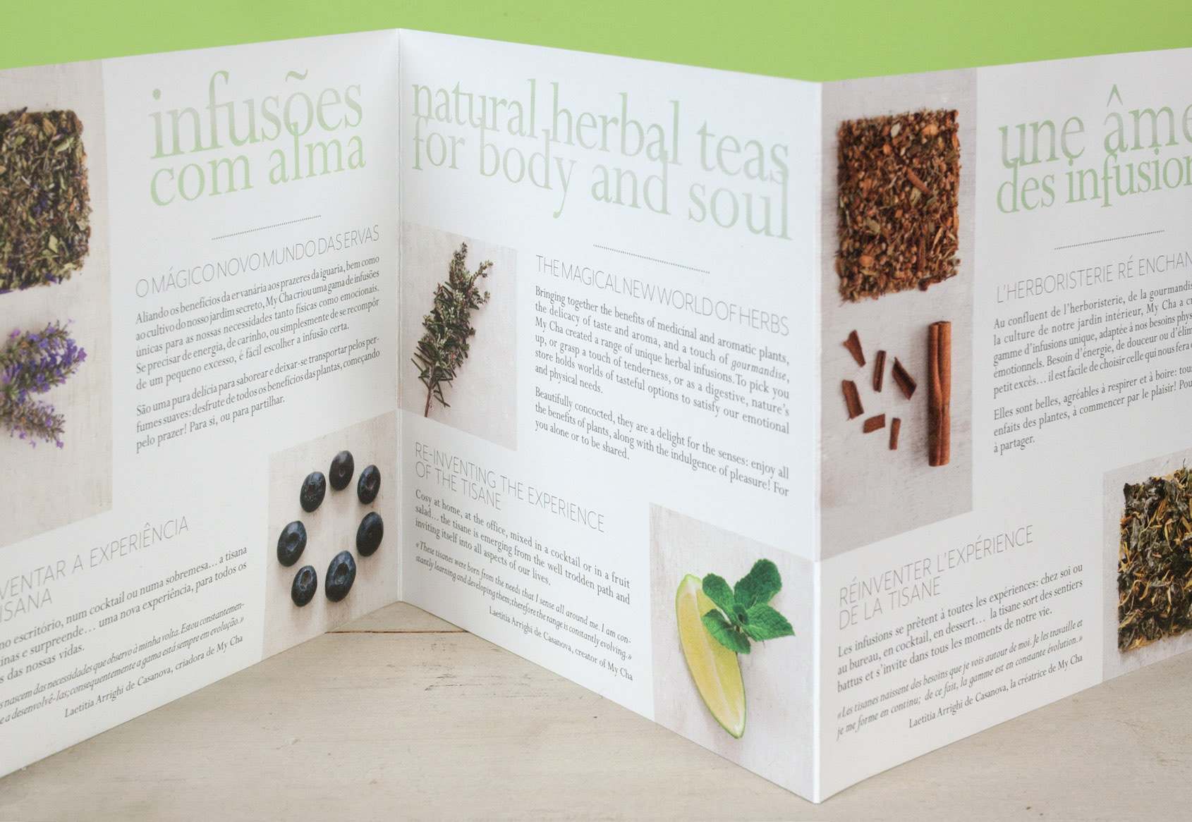

Tri-lingual brochure
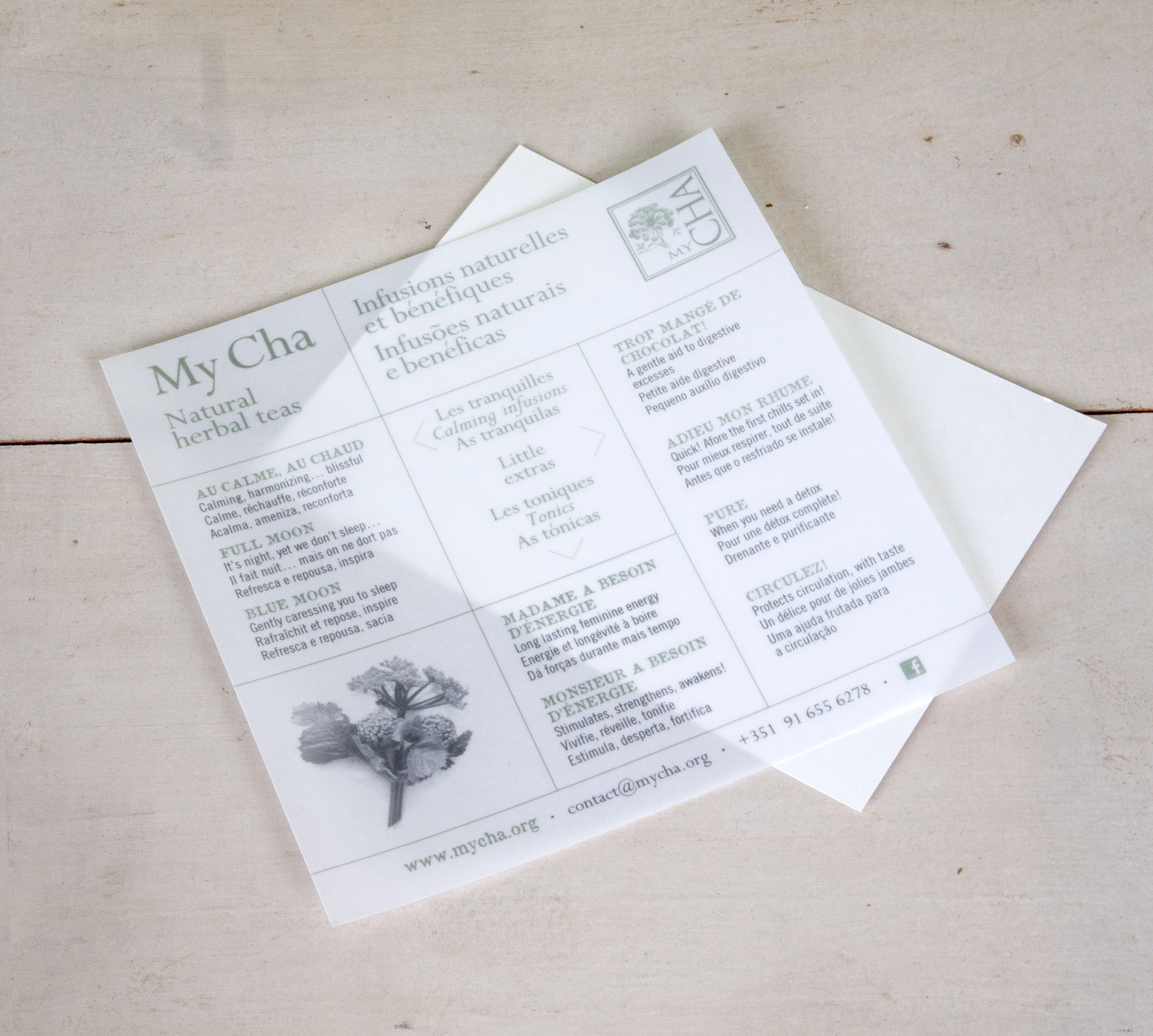
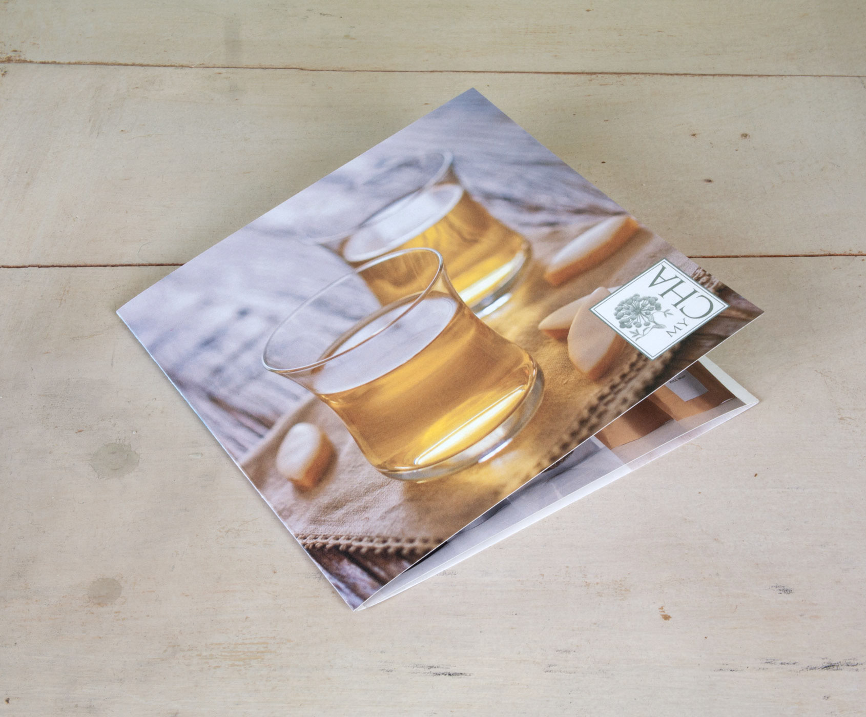
Flyer
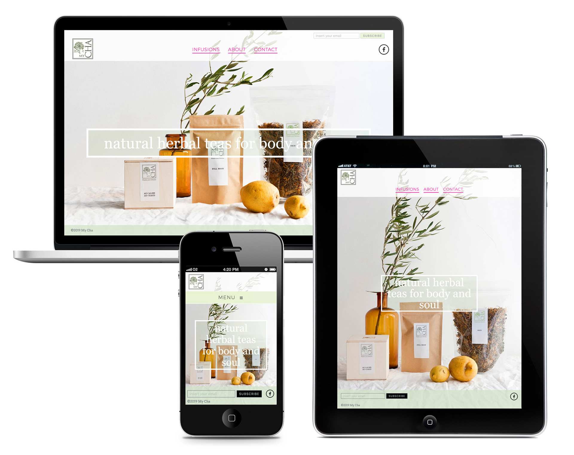
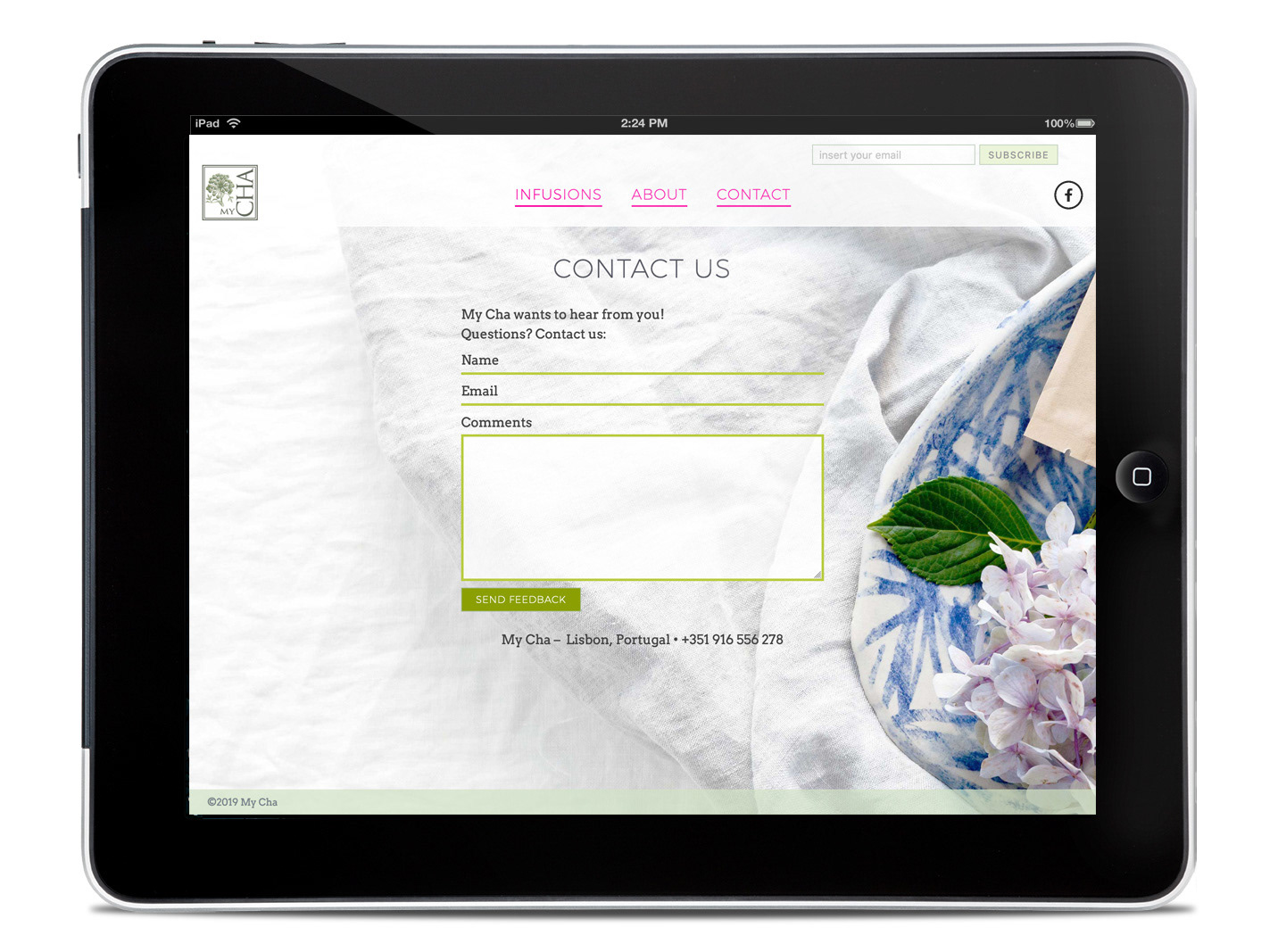
The main visual identity concept is to focus on the ingredients and keep all other elements very simple and light.
Bringing in some of its key qualities such as 'natural' and 'aromatic' to the choice of the paper stock and to the colour palette: using recycled unbleached paper (when possible) and on occasion, complimentary bright colours are used as graphic elements.
Bringing in some of its key qualities such as 'natural' and 'aromatic' to the choice of the paper stock and to the colour palette: using recycled unbleached paper (when possible) and on occasion, complimentary bright colours are used as graphic elements.

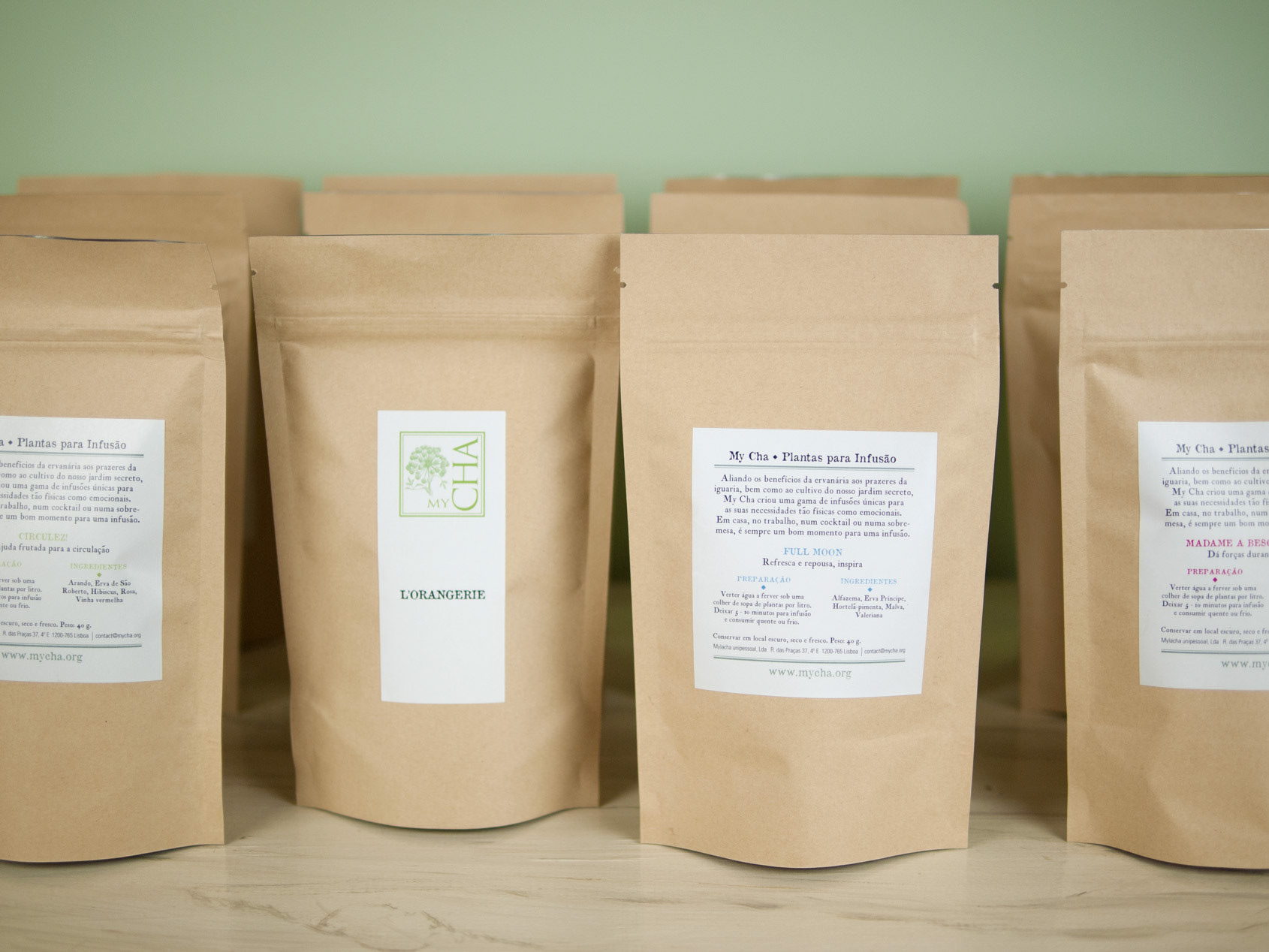
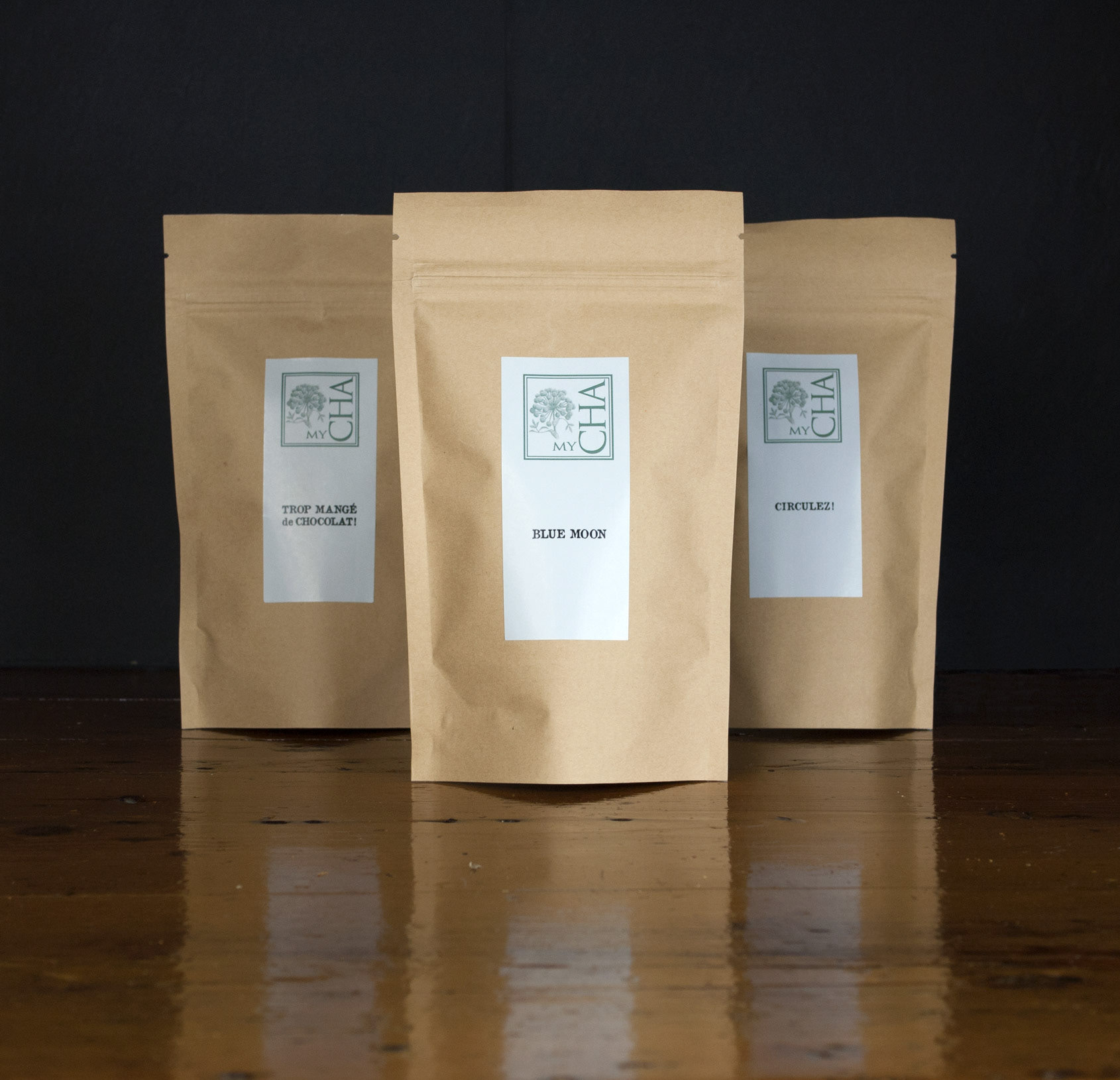
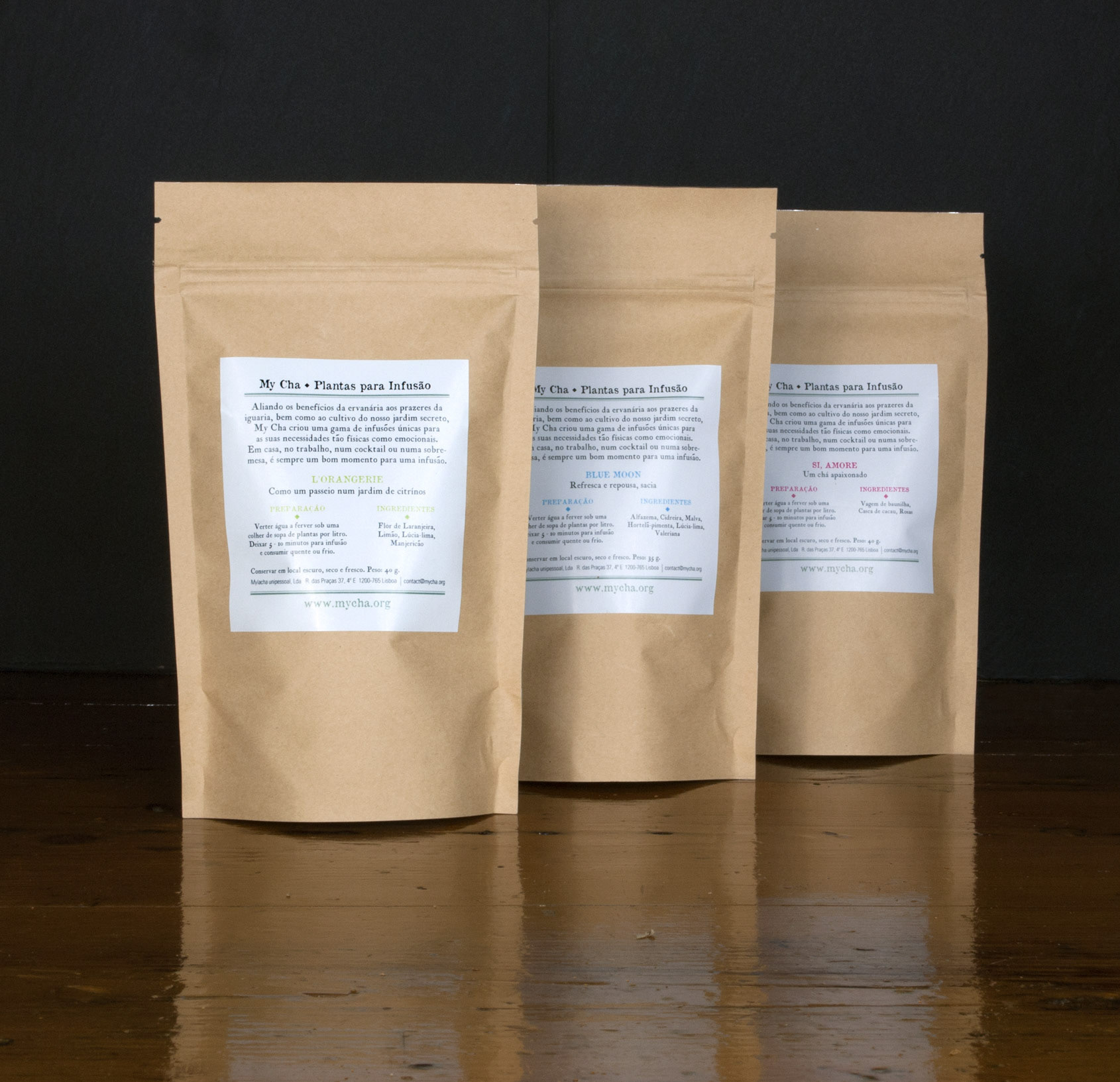
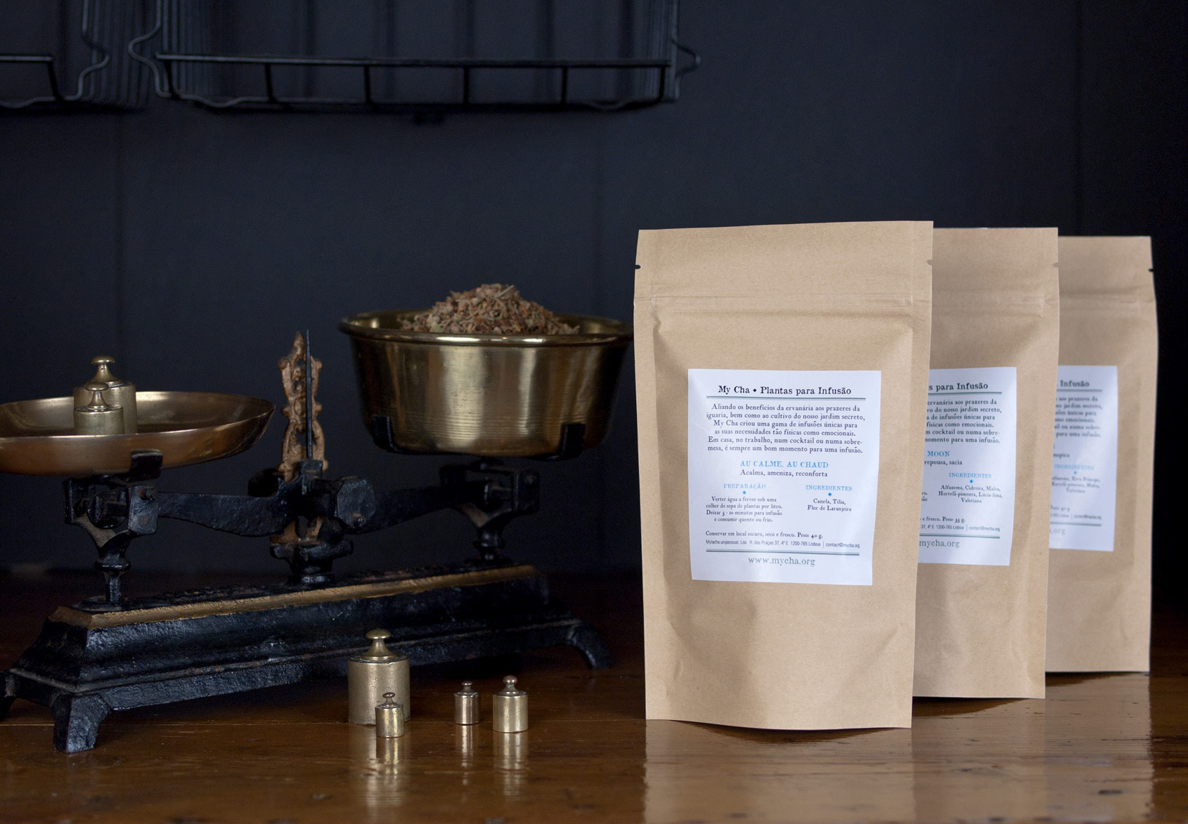
Packaging
Front and back labels
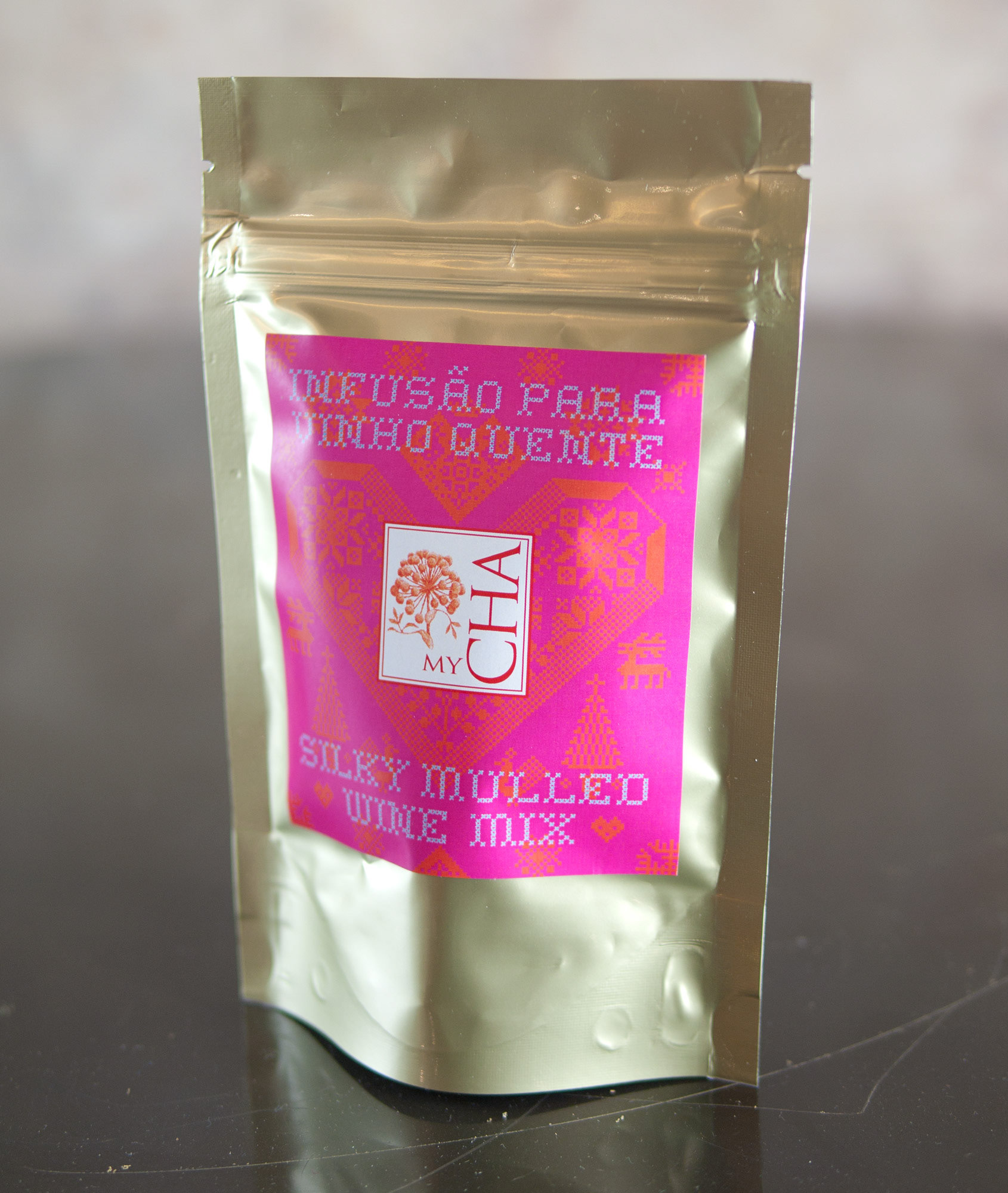

Mulled Wine Mix
Taking inspiration from its origins, the label has in the background a composition
made with Scandinavian embroidery motifs. The color palette uses very strong
colours for a warm effect.
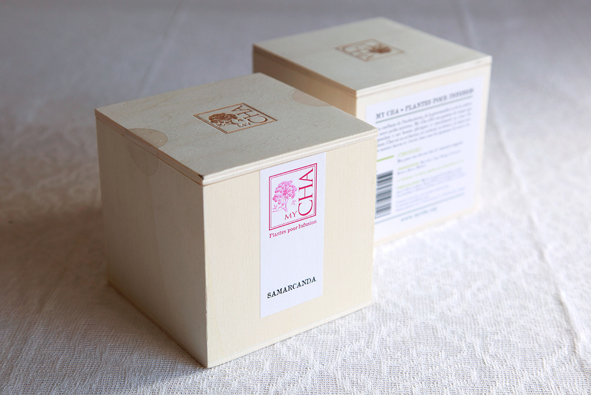

Packaging Box
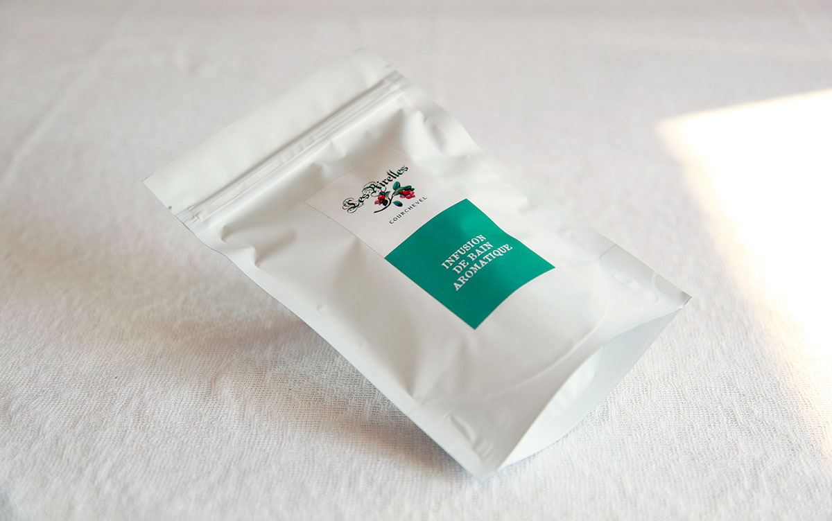
Infusion de Bain
My Cha pour Les Airelles
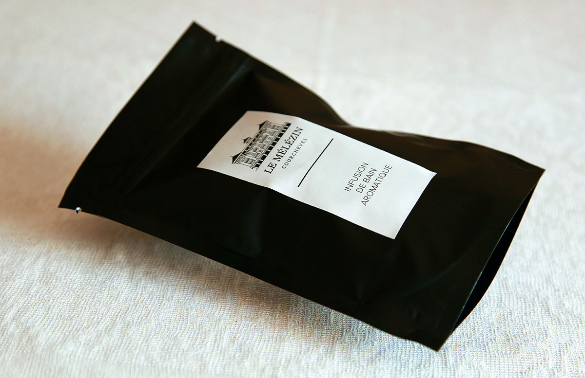
Infusion de Bain
My Cha pour Le Mélézin

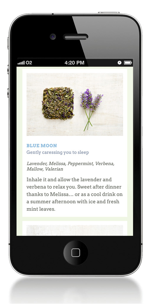
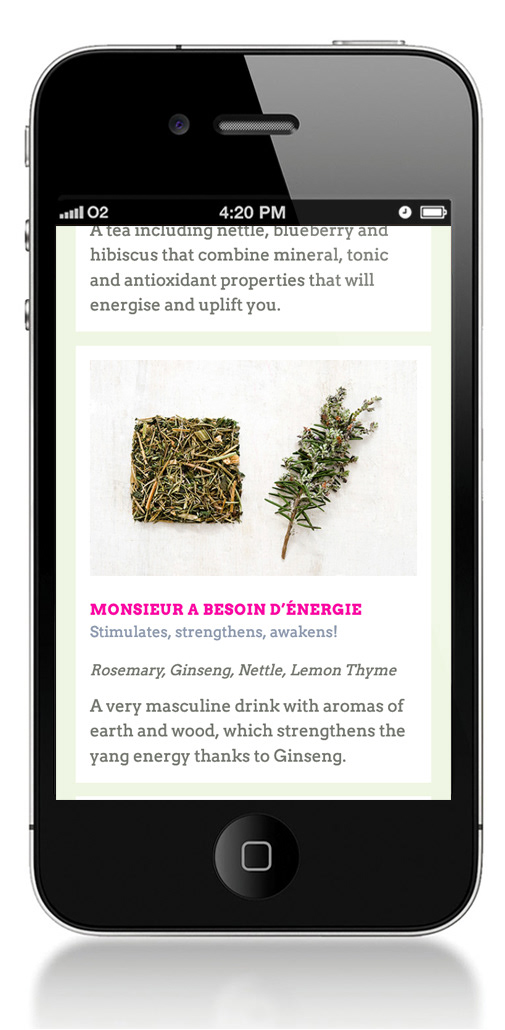
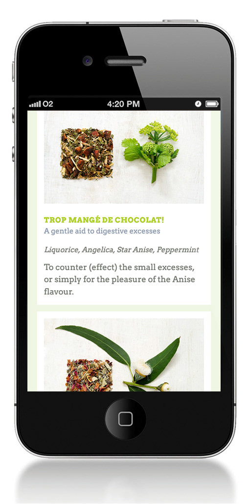
Email Newsletter
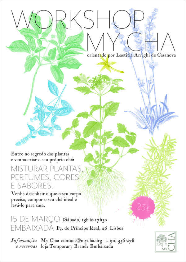
Workshop flyer

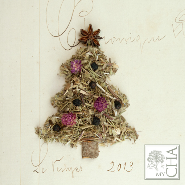
Christmas cards